
Your syllabus looks great—until students try to search, copy, or use AI tools. The good news: A few small tweaks can make all the difference.
Picture this: you open two digital versions of the same syllabus text on your screen.
Version 1 (Accessible):
Required Materials:
- Textbook: Strategic Data Analytics: A Managerial Perspective (3rd Edition)
- Additional readings posted on Canvas
Grading Breakdown:
- Assignments: 40%
- Midterm Exam: 25%
- Final Project: 35%
Late Work Policy:
- Submitted within 24 hours after due date: -10% penalty
- Submitted within 48 hours after due date: -20% penalty
- No submissions accepted after 48 hours without a documented emergency
Version 2 (Screenshot):
This looks almost identical to Version 1—but it can’t be searched, copied, or read by screen readers.
At first glance, they might look identical. But for many students—and AI-powered tools that could assist them—one of these versions is inaccessible.
The first version works exactly as you’d expect—you can search for deadlines, highlight policies, or have your screen reader narrate it. Need to grab an email address? Just copy and paste. Using AI study tools? They can easily process every word.
The second version? It’s just an image. Many of us use screenshots to preserve formatting, but this choice unintentionally blocks AI chatbots, screen readers, translation tools, and mobile accessibility. Information can’t be copied, searched, or processed correctly, creating barriers for students who rely on non-traditional ways of engaging with content.
And this issue goes beyond higher education—accessibility barriers exist across the web. In fact, less than 5% of the world’s top websites meet basic accessibility standards. That means millions of people struggle to access essential information just because of formatting choices. Something as simple as a neatly formatted grading scale might seem clear to you but can be unreadable to both assistive technologies and AI tools if it’s saved as an image or poorly structured.
The good news? A few small formatting tweaks can make a big difference. Whether students are using screen readers, AI assistants, translation tools, or mobile devices, accessible content ensures they can engage with your materials as intended.
This article highlights four common pitfalls—some you may already know, others you might not have considered—and shows how to fix them so your content is both student- and AI-friendly.
Note: This blog post reflects the state of AI tools and capabilities at the time of writing. Given the pace of change in this space, some tools or features may have since been updated.
Challenge 1: Text Trapped in Images
Like you saw in the introduction, course materials that rely on screenshots and images of text can create barriers for users. These barriers affect:
- Assistive technology users who can’t access content because screen readers can’t interpret images of text
- Language learners who can’t easily use translation tools since they can’t select or copy text from images
- Mobile users who struggle with blurry, illegible content when zooming images on small screens
- All students who lose the ability to search, highlight, or annotate important information
- AI tools that can’t read or process information locked in images
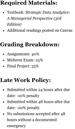
Before (Problematic Format):
The text in this screenshot of a syllabus section isn’t selectable, may not be readable by screen readers or AI, becomes blurry when zoomed, and can’t easily be copied or searched. (Note: If you’re using a screen reader to access this article, you may want to skip to the next header.)
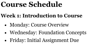
After (Accessible Format):
By including the content as text rather than an image, you make it easy to access for both students and AI tools.
Course Schedule
Week 1: Introduction to Course
- Monday: Course Overview
- Wednesday: Foundation Concepts
- Friday: Initial Assignment Due
Why the Accessible Format Works Better:
- For Assistive Technology Users
- Screen readers can access and interpret all content
- Text-to-speech tools process information correctly
- Content remains clear when magnified
- For Language Learners
- Easy to copy text into translation tools
- Can look up unfamiliar words instantly
- Font adjustments for better readability
- For Mobile Users
- Text reflows naturally on small screens
- Sharp, clear content at any zoom level
- Simple to copy information for notes
- For All Students
- Full text search with Ctrl+F/Command+F
- Highlighting and annotation capabilities
- Content is accessible online and offline
- For AI tools
- Can access and interpret the content
- Processes text accurately for student queries
- Maintains context when referencing information
Challenge 2: Poorly Structured Tables
When you use spaces or tabs to create visual alignments in the tables you include in course materials, the results break down in different viewing contexts and create barriers for many users. This especially impacts:
- Screen reader users who hear random spaces instead of structured data
- Students with visual processing needs who struggle to track misaligned information
- Anyone trying to copy schedule information into other tools
- Students who need to quickly scan for dates and deadlines
- AI tools that can’t reliably interpret manually-spaced data
Before (Problematic Format):
This is a poorly structured table with inconsistent spacing, no true column structure, and that breaks when copied. (Note: If you’re using a screen reader to access this article, you may want to skip to the next header.)
Week Topic Due Points
1. Intro 9/1 10
2 Theory 9/8 20
After (Accessible Format):
Using the built-in table tool in your word processor makes the information in your table easy to read–for students and AI tools.
| Week | Topic | Due Date | Points |
| 1 | Intro | Sept 1 | 10 |
| 2 | Theory | Sept 8 | 20 |
Why the Accessible Format Works Better:
- For Screen Reader Users:
- Screen readers can announce what each column represents
- Each cell’s content is connected to its column heading
- Information flows in a logical order
- For Visual Processing:
- Clear alignment makes information easier to track
- Consistent spacing reduces cognitive load
- Visual boundaries help separate information
- For Digital Navigation:
- Content can be copied without losing formatting
- Table structure maintains integrity when exported
- Data can be easily transferred to planning tools
- For All Students:
- Clear columns help organize related information
- Consistent formatting reduces confusion
- Quick scanning for specific information
- For AI Tools:
- Can identify and understand tabular relationships
- Maintains data structure when processing information
- Accurately interprets column headers and cell contents
Challenge 3: Dense, Unstructured Text
Dense blocks of text can appear in policies, assignments, schedules, and instructions. This unstructured content creates barriers for all users, but especially impacts:
- Screen reader users who can’t easily navigate through unstructured content
- Students with learning disabilities who need clear visual organization
- Non-native English speakers who benefit from consistent, clear formatting
- Students trying to quickly find specific information
- AI tools trying to locate and interpret specific policies
Before (Problematic Format):
This dense, unstructured text has no clear structure and inconsistent formatting–and it buries critical information in a dense paragraph. (Note: If you’re using a screen reader to access this article, you may want to skip to the next header.)
SUBMITTING WORK: All work must be submitted through Canvas (no email submissions will be accepted!) by 11:59pm on the due date. If you submit late there’s a penalty of 10 points off per day late, up to 3 days, after that no submissions accepted without documentation for extenuating circumstances!
After (Accessible Format):
Organizing the same information using line breaks and clear headers makes it more accessible to students and AI tools.
Assignment Submission Guidelines
Submission Platform
- Submit all assignments through Canvas
- Email submissions are not accepted
Deadlines
- All assignments due by: 11:59 PM Eastern Time on the specified date
- Late Submission Penalties:
- 1 Day Late: -10 points
- 2 Days Late: -20 points
- 3 Days Late: -30 points
- 4+ Days Late: Not accepted without documentation
Why the Accessible Format Works Better:
- For Screen Reader Users:
- Clear headings provide navigation points
- Properly formatted lists are announced correctly
- Information is organized in logical chunks
- For Students with Learning Disabilities:
- Information is visually organized
- Key points are broken out
- Related information is grouped together
- For Non-native English Speakers:
- Simple, clear language
- Consistent formatting
- Important terms are emphasized
- For All Students:
- Easy to scan
- Clear hierarchy of information
- Quick to reference
- For AI Tools:
- Content structure enables accurate information retrieval
- Consistent formatting helps identify key requirements
- Hierarchical organization aids in answering specific queries
Challenge 4: Unclear Information Hierarchy
Course materials often lack clear organizational structure, presenting content in a flat, undifferentiated format. Without an information hierarchy, information becomes a confusing tangle that impacts:
- Students with executive function challenges who need clear organization to process information
- Screen reader users who rely on heading structure to navigate content effectively
- Students who struggle with cognitive processing and need information in manageable chunks
- Anyone trying to quickly locate and understand key information
- AI tools that need structured content to accurately answer questions
Before (Problematic Format):
This disorganized text has a flat structure, missing relationships between content, and inconsistent formatting. (Note: If you’re using a screen reader to access this article, you may want to skip to the next header.)
WEEK ONE:
Everything you need to know about the first week.
READINGS: Chapter 1 and syllabus
ASSIGNMENTS: Discussion post (due Friday 9/5 EOD)
QUIZ: Monday
After (Accessible Format):
This organized version of the same text is easier for students and AI tools to navigate.
Week 1: Course Introduction
Required Reading
- Chapter 1: Foundations of the Field
- Course Syllabus
Assignments
- Discussion Post
- Due: Friday, Sept 5, 11:59 PM
- Topic: Your Research Interests
- Length: 250-300 words
- Syllabus Quiz
- Due: Monday, Sept 4, 11:59 PM
- Format: Multiple Choice
- Time Limit: 20 minutes
Why the Accessible Format Works Better:
- For Executive Function Support
- Hierarchical structure shows clear relationships
- Related information is visually grouped
- Important details stand out
- Content flows logically
- For Screen Reader Navigation
- Heading structure enables efficient movement
- Nested lists convey relationships
- Content hierarchy provides context
- Information is programmatically connected
- For All Students
- Important information is easy to locate
- Structure is consistent and predictable
- Content is scannable
- Relationships are immediately clear
- For AI Tools
- Can navigate through structured content levels
- Understands relationships between information
- Provides more accurate and contextual responses
- Locates specific details within their proper context
This improved format helps create accessible course materials that support all users in finding and understanding information effectively.
Better Content, Better Learning
Structuring course materials accessibly allows students to:
- Independently locate information, reducing repetitive questions
- Focus on learning content rather than navigating documents
Clear organization benefits:
- Students balancing multiple courses
- Users on various devices
- Learners utilizing translation tools
- Teaching assistants
- AI tools aiding student learning
The result? More time for meaningful teaching and learning interactions, rather than clarifying document organization or repeating information that should be easily findable.
Making the Change: Start Small
1. Use Headers
Use built-in heading styles (not just bold or large text)
- Create a clear hierarchy:
- Title: Document title
- H1: Major sections
- H2: Subsections
- Keep heading text concise and descriptive
2. Format Lists Correctly
- Use bullet points for related but unordered items
- Use numbered lists for sequential steps or prioritized items
- Maintain consistent formatting:
- Same bullet style throughout
- Consistent indentation
- Parallel grammatical structure
3. Structure Tables Appropriately
- Include clear column headers
- Avoid merged cells
- Use table tools (don’t create “tables” with spaces or tabs)
- Keep tables simple and linear
- Provide row headers when appropriate
4. Support Visual Elements
- Provide a text-based table that conveys the same information alongside any complex graphics or charts
- Include meaningful alternative text for all images in documents, PDFs, and other materials
- Never rely solely on color to convey information
- Avoid using images as the sole method of conveying information
5. Format Text Accessibly
- Use sufficient font size (minimum 11pt for body text)
- Choose readable fonts (serif or sans-serif)
- Use line spacing of at least 1.15
- Use accessible color contrast ratios and test color contrast
- Ensure hyperlink text is descriptive
6. Check Document Accessibility
- Run built-in accessibility checkers:
- Review your content on multiple devices:
- Desktop computer
- Tablet
- Mobile phone
7. Save Accessibly
- Use “Save As PDF” instead of “Print to PDF”
- Ensure hyperlinks remain active
Beyond AI: Creating Truly Inclusive Courses
Accessibility has always mattered. AI is just making it impossible to ignore. When we create accessible course materials:
- Students with disabilities can access content independently
- Non-native English speakers can better understand expectations
- Everyone benefits from clearer, more organized information
- Support tools (whether AI or screen readers) work properly
- You spend less time answering basic questions
The best part? These improvements don’t require special software or extensive training. Start with one document, make it more accessible, and build from there. Remember: Good design isn’t about accommodating AI. It’s about creating course materials that work for everyone.
What’s the Research?
Research shows that thoughtfully structured course materials improve accessibility and align with how students learn. Two research frameworks help explain why: Cognitive Load Theory reveals how properly structured materials help students manage finite mental resources, while Universal Design for Learning (UDL 3.0) demonstrates how accessible design supports deeper engagement for all learners. Let’s explore how these evidence-based approaches can help you design your course content.
1. Cognitive Load Theory
The principles behind accessible course design are supported by cognitive load theory (CLT), an instructional theory based on human cognitive architecture. Developed by John Sweller, CLT focuses on two key components of our cognitive architecture: working memory (where we actively process new information) and long-term memory (where we store what we’ve learned).
Decades of research have revealed a striking limitation: our working memory can only process about 3–4 new pieces of information at once (Cowan, 2001, as cited in Sweller, 2011). When course materials require learners to juggle too many interacting elements, it creates what researchers call “extraneous cognitive load”—mental effort that distracts from rather than supports learning.
To address that challenge, Sweller proposes specific principles that can guide the design of accessible course materials:
- Information store principle: Learning requires building up organized knowledge in long-term memory. When course materials lack clear structure, it becomes more difficult for students to build and retain organized knowledge.
- Borrowing and reorganizing principle: Humans learn most effectively by receiving well-organized information from others. When we force students to reorganize poorly structured content themselves, we’re adding unnecessary cognitive work.
- Narrow limits of change principle: Because working memory is so limited when dealing with new information, we need to be careful about how we present new material. Each extra mental task we add – like having to search through dense text or piece together scattered information – takes away from the resources available for actual learning.
These principles explain why accessibility practices are so effective. Clear document structure, logical organization, and integrated information aren’t just conveniences; they align with how human learning works. By minimizing unnecessary cognitive burdens, accessible design ensures that students can focus their mental energy on understanding content rather than struggling with its presentation.
2. Universal Design for Learning Guidelines 3.0
The accessibility improvements recommended in this post are also grounded in Universal Design for Learning (UDL), a research-based framework for creating flexible learning experiences. UDL research shows that when we remove barriers to information access and provide multiple ways to engage with content, we improve learning outcomes for all students, including those with documented disabilities (CAST, 2018).
Three key UDL considerations particularly support these recommendations:
- UDL Consideration 1.1 emphasizes the importance of customizable information display. Research shows that when students can adjust how content is presented (font size, spacing, color contrast), they’re better able to focus on learning the material rather than struggling with its presentation. This directly supports our recommendations for moving away from fixed formats like images of text and inflexible table layouts.
- UDL Consideration 1.2 highlights the need for multiple ways to perceive information. Studies demonstrate that providing content in various formats (text, audio, visual) helps students with disabilities—and it also benefits others, including non-native speakers and students with different learning preferences. This research validates our emphasis on proper document structure and screen reader compatibility.
- UDL Consideration 3.2 focuses on highlighting patterns and relationships in information. Research shows that clearly structured content reduces cognitive load and helps students identify key concepts more effectively. This supports our recommendations for a clear information hierarchy and proper document organization.
These research-backed principles show that good document design supports deeper learning for all students. When we structure content to align with how people actually process information, we remove unnecessary barriers and help students focus on what matters: engaging with the course material.
References
CAST. (2024). Universal design for learning guidelines 3.0. https://udlguidelines.cast.org
Sweller, J. (2011). Cognitive load theory. The Psychology of Learning and Motivation, 55, 37–76. https://doi.org/10.1016/B978-0-12-387691-1.00002-8