
AI-generated images can be eye-catching, but do they actually help your students learn?
Striking graphics grab people’s attention, but they don’t always boost learning. In fact, images with irrelevant details can stand in the way of learning. So how can you pick the right visuals for your teaching?
In this post, we’ll explore a research-backed framework for creating and curating effective educational images. Our goal is to help you choose and create visuals that engage students while reinforcing key concepts.
Ready to level up your teaching materials? Let’s dive in!
Tip: If you’re a faculty member, student, or staff member at MIT, you can access AI image generation tools for free through Microsoft Copilot.
How Visuals Impact Learning
If you want to incorporate more visuals into your teaching, you’ve got research on your side. Decades of studies show that people can learn more from words and graphics than from words alone (Mayer, 1989; Mayer & Anderson, 1991, 1992; Mayer, Bove, Bryman, Mars, & Tapangco, 1996; Mayer & Gallini, 1990; as cited in Mayer, 2009). In his foundational 2009 book Multimedia Learning, educational psychologist Richard Mayer gives this finding a name: the Multimedia Principle.
However, Mayer—along with other researchers like Atkinson (2002, as cited in Mayer, 2009) and Hegarty and colleagues (1991, 1993, as cited in Mayer, 2009)—emphasizes that different kinds of images have different impacts on learning. A study by Sung and Mayer (2012) suggests that any graphic in a learning experience will fall into one of these three categories:
- Instructive images: These visuals directly support learning and facilitate essential cognitive processing of core concepts. For example, a diagram illustrating Porter’s Five Forces can help students better understand this business strategy framework.
- Decorative images: These graphics enhance aesthetics but don’t influence learning. For example, an image of a business handshake can be visually appealing but won’t support or obstruct students’ understanding of negotiation strategies.
- Distracting images: Sung and Mayer call this category “seductive” images. While these visuals may relate to the topic, they impede learning because they require extraneous cognitive processing. As an example, consider a complex organizational chart of a full corporation in a lesson on team leadership. The image connects broadly to the lesson but also highlights irrelevant details, distracting students from the key concepts.
The results of Sung and Mayer’s study bear out their hypothesis. They find that, while all three kinds of images improve students’ satisfaction, distracting images detract from students’ learning. These findings support the “coherence principle” that Mayer proposed in 2009–that people learn better from multimedia lessons when the graphics are relevant to the instructional goal.
The table below summarizes Sung and Mayer’s findings:
| Image Category | Impact on Satisfaction | Impact on Learning |
|---|---|---|
| instructive | positive | positive |
| decorative | positive | neutral |
| distracting | positive | negative |
Translating Research into Action
So, how can you use this understanding of different categories of images when you’re designing course materials?
- Choose visuals that align with your learning outcomes. Avoid AI-generated images that are only tangentially related to the topic or include lots of extraneous content. While they might be eye-catching, these images can get in the way of students’ learning by drawing their attention away from core concepts.
- Vet AI-generated images carefully. AI image generators can make mistakes and produce inaccurate details, which can confuse students and undermine learning. If you’re not confident in your ability to assess an image’s accuracy, consider using examples vetted by subject matter experts or omitting the visual altogether.
- Trust your domain expertise. While AI tools are powerful, they’re not a replacement for your subject knowledge. As an educator, it’s important to curate AI-generated visuals with potential pitfalls in mind. Even the most impressive AI graphics can’t substitute for your understanding of the course content.
By following these guidelines, you can choose and create visuals that truly enhance your students’ learning experiences.
Tip: When incorporating images into your teaching materials, include alt text so your images are accessible to students with visual impairments and different learning needs. You can use an AI tool like Microsoft Copilot to help draft alt text—just upload the image along with the prompt, “Follow accessibility best practices to write brief alt text for this image.”
Examples of Different Kinds of Visuals
Note: This blog post reflects the state of AI tools and capabilities at the time of writing. Given the pace of change in this space, some tools or features may have since been updated.
Example 1: The Toothbrush Company
Let’s say you’re teaching an entrepreneurship course. The case at the center of today’s discussion focuses on a company that will be manufacturing and selling a new toothbrush. For decorative purposes alone, you could incorporate AI-generated images like this one of a toothbrush into your presentation.

ChatGPT used DALL-E 3 to generate this image in response to this prompt: “Draw me a picture of a toothbrush.”
For an instructive image that both engages students and enhances understanding, you might create a chart, graph, or infographic. For example, you could generate a break-even analysis chart for your toothbrush company:
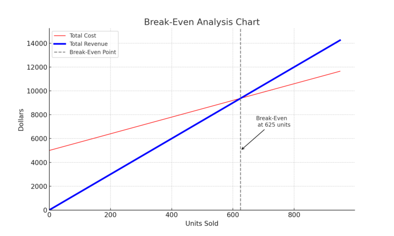
ChatGPT used Advanced Data Analysis to create this image of a break-even analysis chart.
It’s important to note that, while its data analysis tool is up to the challenge, ChatGPT’s built-in image generator (DALL-E 3) cannot currently produce accurate charts, graphs, and infographics. That won’t stop it from trying, though! Other AI image generators have similar limitations.
As an example, we used ChatGPT’s DALL-E 3 to produce this illustration of a break-even analysis chart. With its illegible text and confusing content, this image is much more likely to distract students than help them learn.
ChatGPT used DALL-E 3 to create this image of a break-even analysis chart. Original prompt: “Create an image of a break-even analysis chart.”
Example 2: Team Communication
Let’s say you’re teaching a course on communication strategies. You tell a story about a team lead who overcomes communication barriers within her team. You might generate an instructive image that depicts that team lead during a successful meeting.

Midjourney created this image in response to this prompt: “/imagine A drawing of a woman who’s an empathetic project manager leading a successful collaborative brainstorming meeting.”
Or you might create AI-generated images of teammates actively collaborating during a brainstorming meeting.

Midjourney created this image in response to this prompt: “/imagine simple drawing of team collaboration during a brainstorming activity with post-it notes.”
Just make sure to screen your images for confusing details that could make them distracting. For example, you probably don’t want the team lead to just be one more item on the group’s brainstorming whiteboard!

Midjourney created this image in response to this prompt: “/imagine a drawing of a successful brainstorming meeting with a female team lead”
Example 3: Starbucks in China
Generative AI tools can excel at creating decorative images. The key is making sure the AI-generated images you create are relevant and neutral enough to be decorative rather than distracting.
Say you’re teaching about Starbucks’ market entry in China. You do some brainstorming (maybe with assistance from an AI text generator) and ask Microsoft Copilot to generate an image of Starbucks coffee cup in front of a map of China.

Microsoft Copilot used DALL-E 3 to create this image in response to this prompt: “Create an image of a Starbucks coffee cup in front of a map of China.”
The image looks great at first glance. But then you realize that the map of China looks… strange. For example, the word China appears in two different locations on the map.

The image’s problems make sense given AI tools’ tendency toward hallucination. Also, its inaccuracies could definitely confuse and distract your students.
So, you decide to try again. Maybe you can show a Starbucks coffee cup in a café in China?

Microsoft Copilot used DALL-E 3 to create this image in response to the prompt: “Create an image of a Starbucks cup in a cafe in China.”
Unfortunately, the English text that appears in this image is both prominent and confusing. SARRKES coffee? Also, I don’t know Chinese, and the image includes a lot of characters that might be Chinese. That text could be more gibberish–or it might even be offensive. I’d want to get a better understanding of what’s there before including this image in teaching materials.
Tip: AI-generated images can include inaccuracies that are especially apparent to people with specific cultural knowledge or lived experiences. For example, an AI tool might generate an image that claims to depict a scene from a specific country, but someone familiar with that culture might notice inconsistencies in written language, architecture, clothing, or other visual elements. When in doubt, seek input from those with relevant expertise or opt for visuals from reputable sources so you can make sure your visuals are accurate and inclusive.
At this point, maybe you just ask for an image of a coffee in a Starbucks.

Microsoft Copilot used DALL-E 3 to create this image in response to the prompt: Create an image of a coffee in a Starbucks.
Success! This image is straightforward and aesthetically pleasing. It includes a bit of strange text (on the cafe window) but that text isn’t jumbled or prominent enough to raise many questions from students.
It’s also important to consider when you might add more instructional value by going a non-AI route. For example, you could do a Google search for Creative Commons-licensed images of Starbucks in China and include an image like this one of an actual Starbucks storefront in China:

Source: Just like home [photograph], by booizzy, 2008, Flickr (https://www.flickr.com/photos/booizzy/2483149900). CC BY-ND 2.0 DEED.
What’s the Research?
Richard Mayer’s cognitive theory of multimedia learning provides a framework for understanding how different types of images influence learning (Mayer, 2005; Mayer & Moreno, 2003). Central to this theory is the idea that learners can engage in three kinds of cognitive processing during multimedia instruction: extraneous, essential, and generative processing (DeLeeuw & Mayer, 2008).
- Extraneous Processing: Caused by confusing instructional design elements that do not support the learning goals, such as irrelevant or misleading AI-generated images. This can overload cognitive capacity and detract from learning.
- Essential Processing: Involves selecting and representing the essential instructional material in working memory. The complexity of the material determines the level of essential processing required. Instructive AI-generated images that relate directly to key learning objectives can aid this process.
- Generative Processing: Entails making sense of the material by organizing it and integrating it with prior knowledge. This deeper processing is influenced by learner motivation. AI-generated images that stimulate critical thinking or connections to real-world scenarios can enhance generative processing.
Given the limits on cognitive capacity, it’s important to keep in mind the cognitive load imposed by AI-generated images. Even engaging images that boost satisfaction can impede learning if they prompt extraneous processing that consumes cognitive resources needed for essential and generative processing (Sung & Mayer, 2012).
Universal Design for Learning (UDL) guidelines align with these research findings and provide similar guidance for optimizing the use of AI-generated visuals:
- UDL Consideration 2.5 emphasizes presenting key concepts through multiple media, not just text, to increase comprehension and accessibility. Providing graphical alternatives alongside verbal information activates more neural pathways for deeper encoding. Explore the research behind UDL Consideration 2.5.
- UDL Consideration 3.3 stresses the importance of guiding learners’ information processing strategies through embedded models, scaffolds, and feedback. Removing unnecessary visual distractions aligns with this principle by enabling sharper focus on essential instructional goals. Explore the research behind UDL Consideration 3.3.
- UDL Consideration 3.4 highlights maximizing transfer and generalization to new contexts as critical for durable learning. Using multiple representations and anchoring new ideas into familiar contexts promotes the flexible retrieval needed to apply knowledge broadly. AI visuals tightly aligned to planned examples can provide vivid touchpoints serving this aim. Explore the research behind UDL Consideration 3.4.
By thoughtfully applying multimedia learning principles and UDL guidelines, we can harness AI capabilities to enhance, rather than distract from, learning experiences. The key is using AI-generated images that manage essential processing, motivate generative processing, and avoid extraneous cognitive load.
References
DeLeeuw, K. E., & Mayer, R. E. (2008). A comparison of three measures of cognitive load: Evidence for separable measures of intrinsic, extraneous, and germane load. Journal of Educational Psychology, 100(1), 223–234. https://doi.org/10.1037/0022-0663.100.1.223
Mayer, R. (2005). Cognitive theory of multimedia learning. In R. E. Mayer (Ed.), The Cambridge handbook of multimedia learning (pp. 31–48). New York: Cambridge University Press.
Mayer, R. (2009). Multimedia learning: 2nd ed. New York: Cambridge University Press.
Mayer, R. E., & Moreno, R. (2003). Nine ways to reduce cognitive load in multimedia learning. Educational Psychologist, 38(1), 43–52. https://doi.org/10.1207/S15326985EP3801_6
Sung, E., & Mayer, R. E. (2012). When graphics improve liking but not learning from online lessons. Computers in Human Behavior, 28(5), 1618–1625. https://doi.org/10.1016/j.chb.2012.03.026
Sweller, J., Ayres, P., & Kalyuga, S. (2011). Cognitive load theory. Springer Science & Business Media.